
BRAND DEVELOPMENT
Building a wellness brand from the ground up.
BRAND STRATEGY · BRAND IDENTITY · PACKAGING · CAMPAIGN · COMMERCIAL PRODUCTION
THE OPPORTUNITY
CREATING A WELLNESS BRAND BUILT TO GROW
HealthyBest was a new supplement company entering the health and wellness market. Starting from the ground up, the challenge was to establish a distinctive brand identity that could build consumer trust, connect with different wellness needs and support an expanding portfolio of products.
Our team was responsible for developing the brand strategy, visual identity, packaging and advertising, creating a cohesive brand experience from its initial concept through consumer-facing campaigns.

THE IDEA
LIVE A HEALTHIER YOU.
Wellness is personal. Everyone has different goals, challenges and priorities when it comes to their health.
We built HealthyBest around that understanding, creating a brand that felt approachable, optimistic and grounded in everyday life.
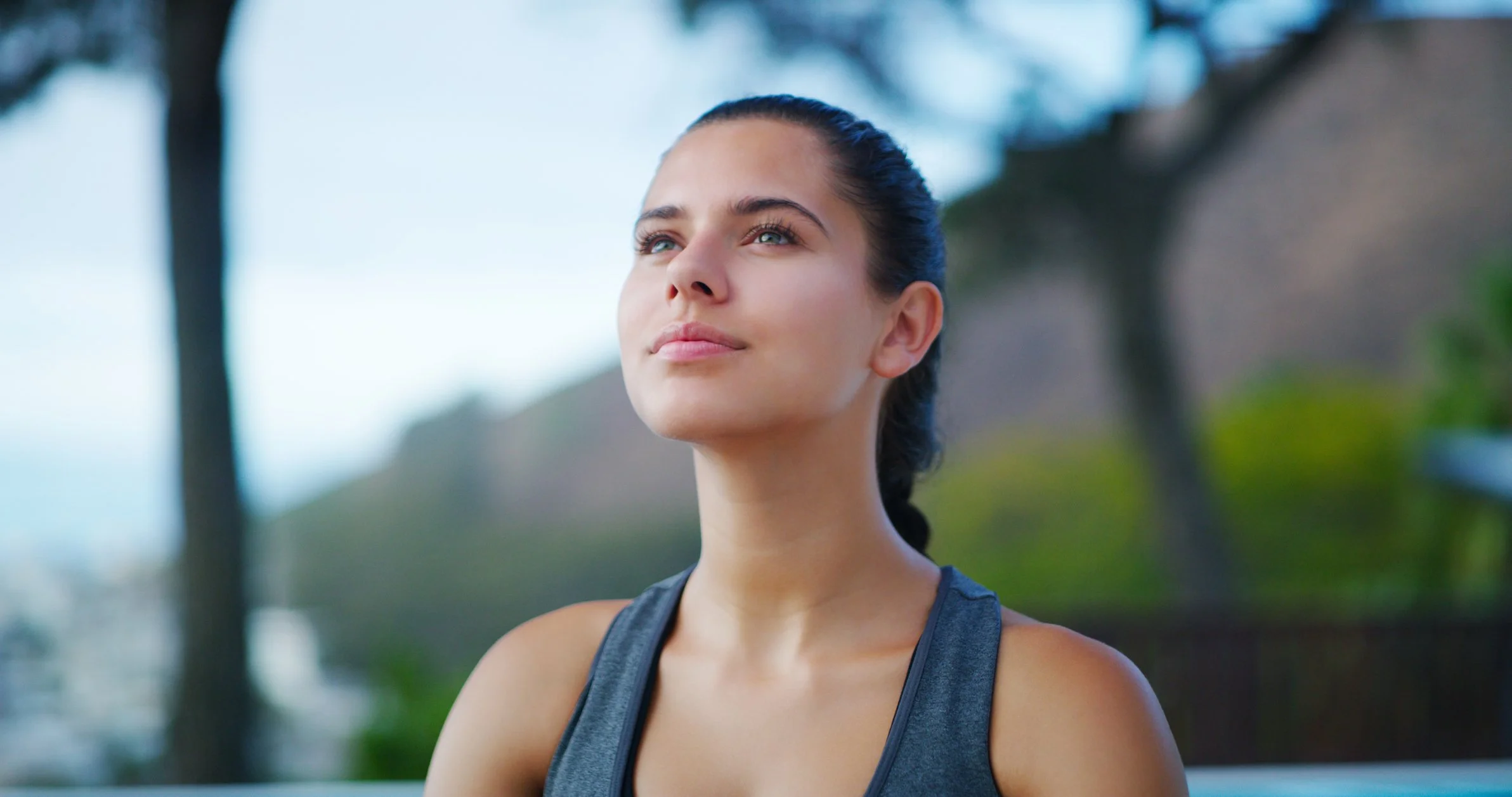
The creative direction combined a clean, contemporary identity with authentic lifestyle photography and a distinctive fingerprint-inspired graphic system. The fingerprint became a visual expression of individuality, reinforcing the idea that a healthier life looks different for everyone.
Live a Healthier You became the unifying message, connecting the brand's identity, products and advertising.
THE VISUAL IDENTITY
A RECOGNIZABLE IDENTITY. A FLEXIBLE SYSTEM.
We developed a complete visual language designed to establish consistency while giving the brand room to grow.
The HealthyBest identity combined a distinctive monogram and wordmark with a modern typographic system, a confident blue color palette and a fingerprint-inspired graphic texture.
Together, these elements created a recognizable visual signature that could extend across packaging, marketing materials, digital platforms and broadcast advertising.
TYPOGRAPHY & COLOR
Typography played an important role in establishing a clean, contemporary personality. Oscine served as the primary brand typeface, supported by FinalSix for product identities and Open Sans for digital applications.
The core palette of Sky Blue, Chambray and Cloud established the master brand, while a broader range of colors gave individual products their own identities within the system.

ONE BRAND. MULTIPLE WELLNESS NEEDS.
THE PRODUCT SYSTEM
ONE BRAND. MULTIPLE WELLNESS NEEDS.
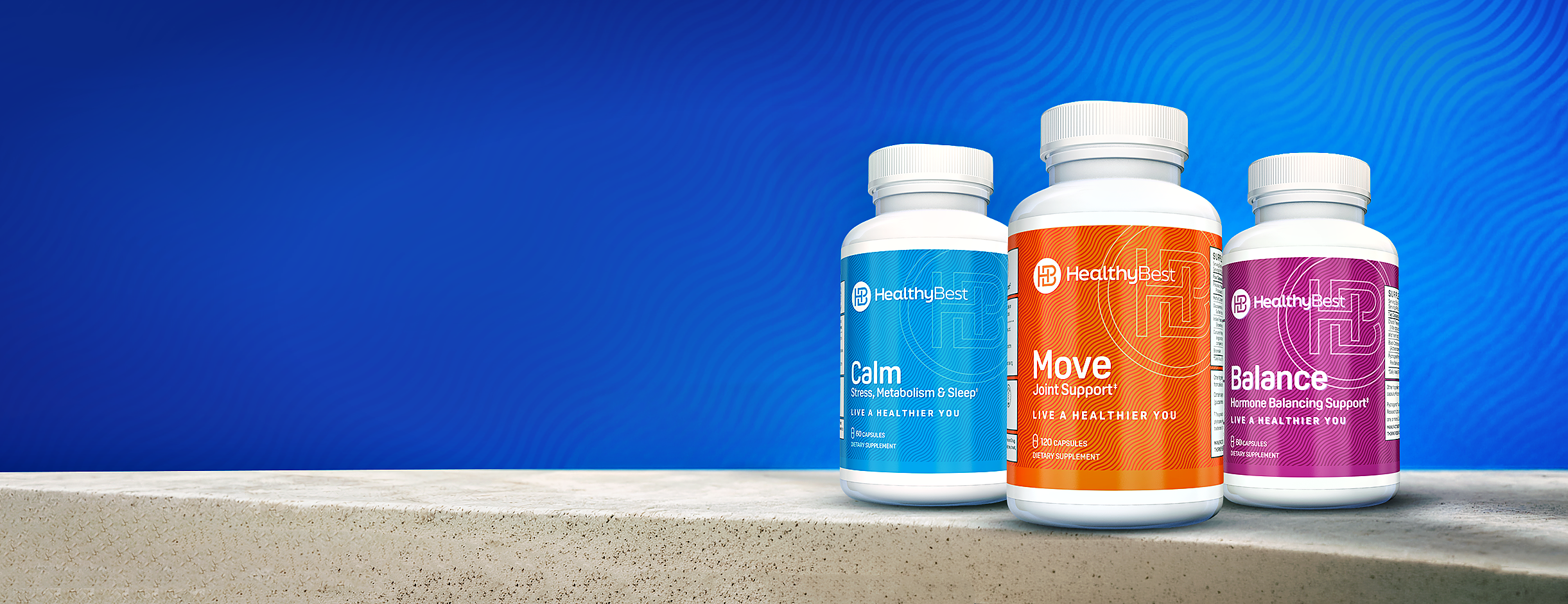
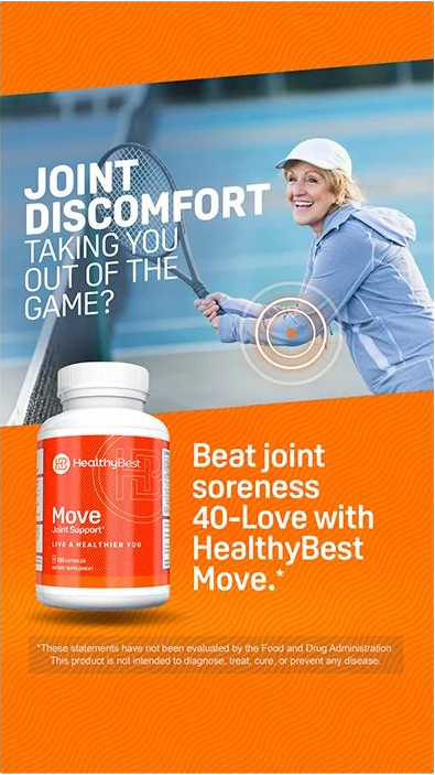
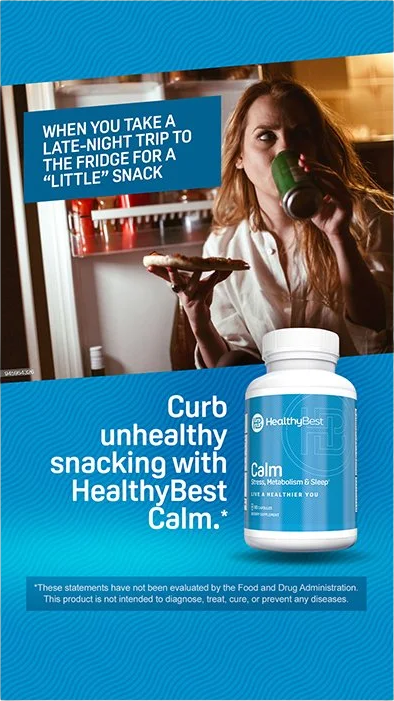
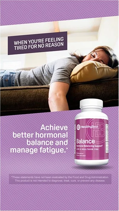
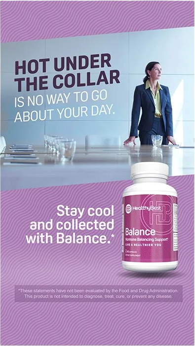
As the product portfolio expanded, the identity needed to accommodate different wellness categories without losing its connection to the parent brand.
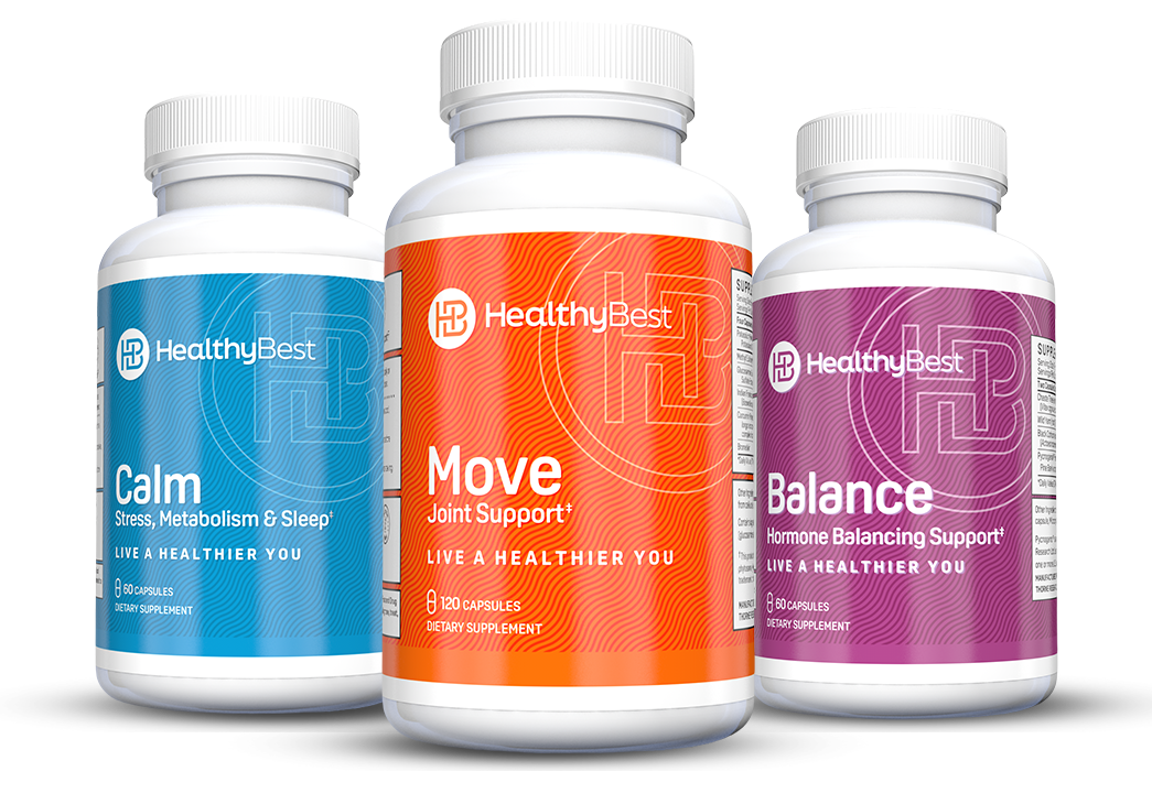
We developed a flexible sub-brand system that maintained consistent typography, packaging architecture and graphic elements while introducing individual colors and product names.
From Calm and Move to the brand's other wellness offerings, each product could establish its own personality while remaining unmistakably HealthyBest.
The result was a scalable identity system designed to support new products and categories as the business grew., contemporary personality. Oscine served as the primary brand typeface, supported by FinalSix for product identities and Open Sans for digital applications.
The core palette of Sky Blue, Chambray and Cloud established the master brand, while a broader range of colors gave individual products their own identities within the system.
THE PACKING
BRINGING THE BRAND TO THE SHELF
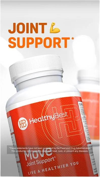
Packaging was one of the most important expressions of the HealthyBest identity.
We translated the brand system into a consistent product experience, combining bold color, clear product naming, the HealthyBest monogram and the signature fingerprint texture.
The design balanced individual product recognition with a unified visual language, creating a family of supplements that felt connected, approachable and recognizable.
THE WORK
FROM BRAND IDENTITY TO ADVERTISING.
Building the brand was only the beginning.
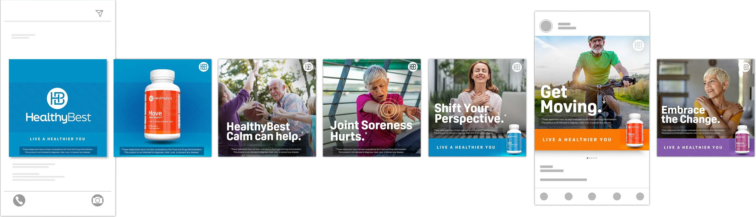
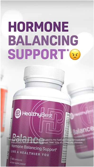
With the identity established, our team extended HealthyBest into consumer-facing advertising, developing and producing a series of commercials that introduced the products and brought the brand's personality to life.
The spots carried the same visual language and optimistic tone established through the brand strategy, combining lifestyle storytelling, product messaging and consistent brand elements.
By overseeing the creative from concept through production and post, we maintained a cohesive brand experience across every execution.

THE OUTCOME
FROM AN IDEA TO A COMPLETE CONSUMER BRAND.
What began as a new supplement company became a fully developed brand with a distinct identity, a scalable product system and a consistent creative platform.
From strategy and identity development to packaging and commercial production, HealthyBest brought together multiple creative disciplines to establish how the brand looked, communicated and connected with consumers.
The project represents the full scope of building a brand, from defining its identity to bringing it into the world.